Project
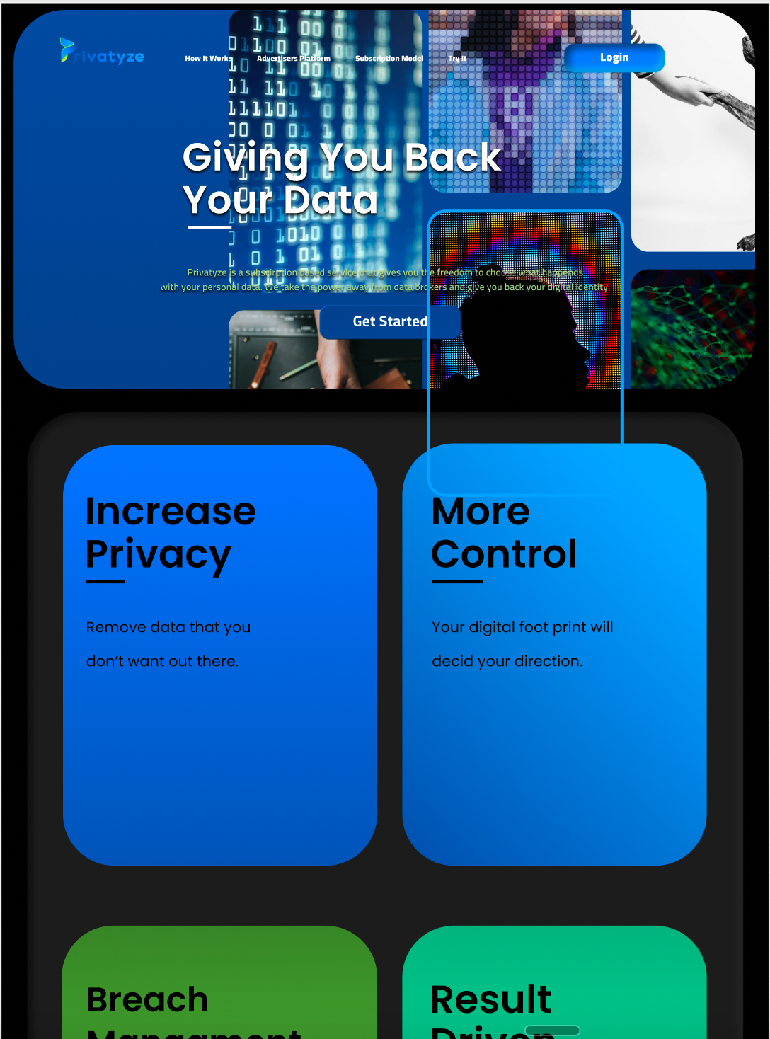
Privatyze Startup
Year
Spring 2022
My Role
UX/UI Design Internship
What I learned
Working for Privatyze I learned alot about startup culture. My mentor, Haydar Majeed, introduced me to Figma and the neumorphic design style that is used for the Privatyze platform. I experienced how to meet the different demands of UX Design working on both mobile and web versions with emphasis on quick design sprint turnarounds.


Junior F/2020
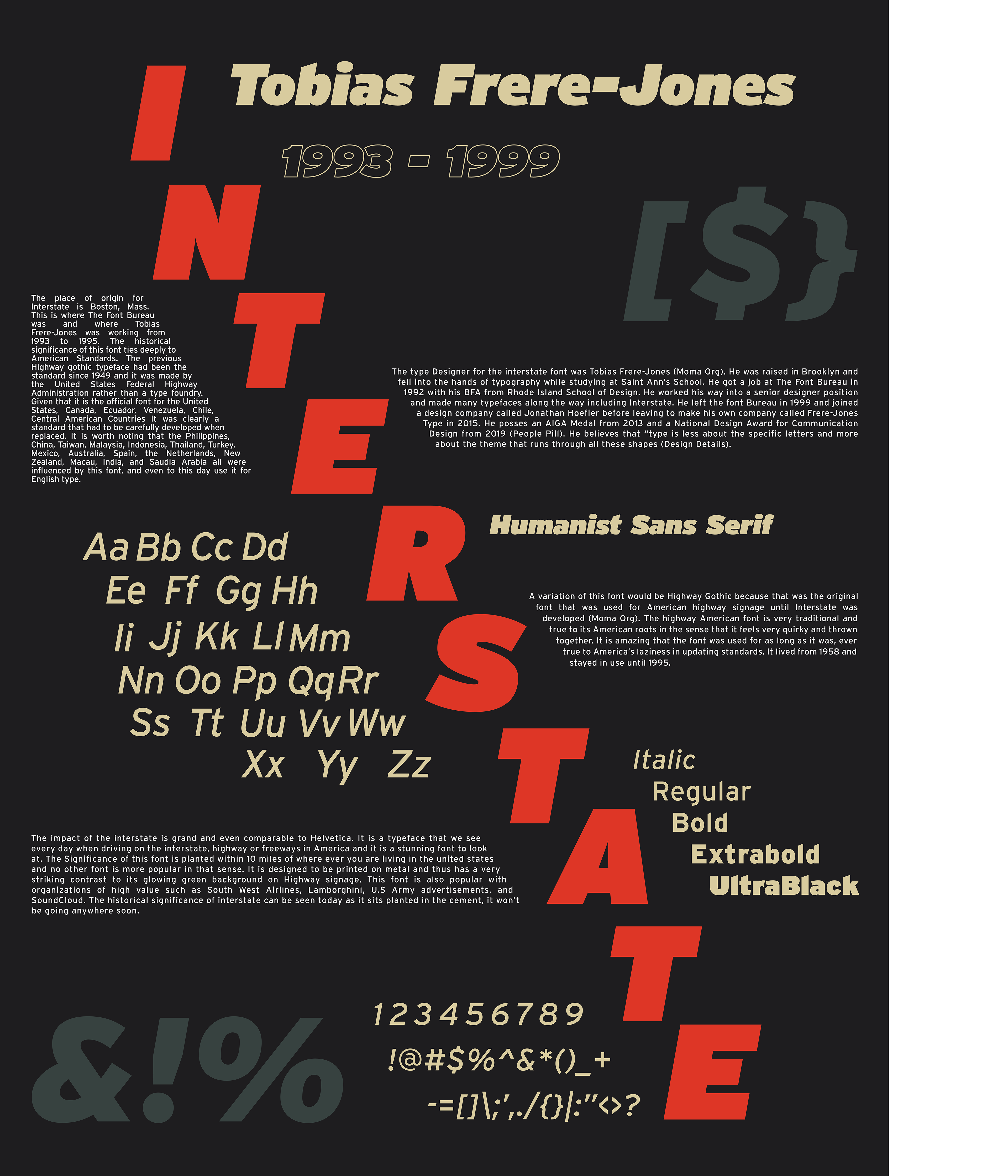
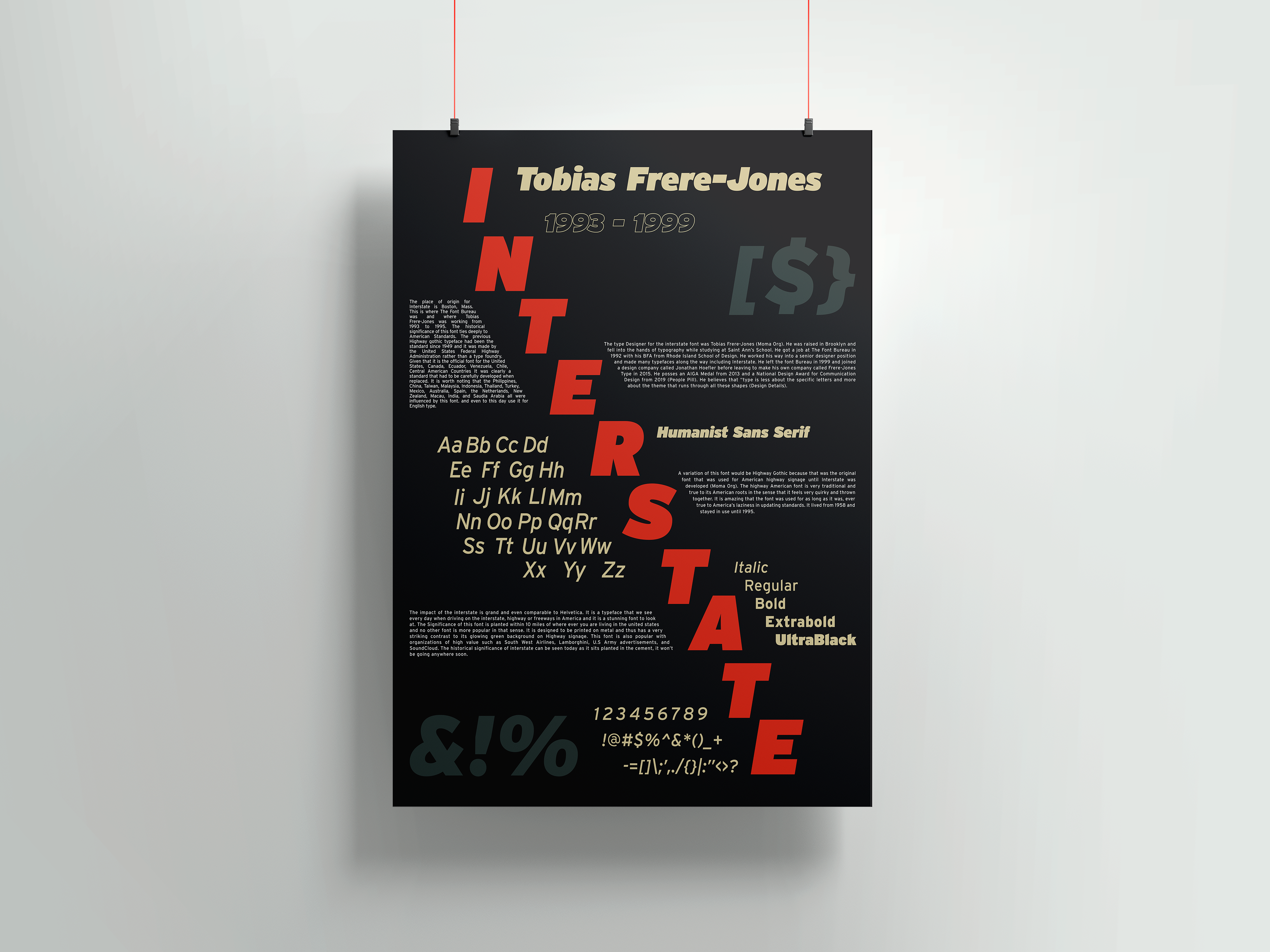
The title of this work is ‘Interstate’ and the year this was made in was 2021. The medium of this work was digital on Adobe Illustrator. This work shows how design can represent a font and showcase the year, name, designer, and capability of the font.
“Interstate” is a design piece that features the font entitled and showcases the fonts' full lettering and punctuation. The sleek modern layout is what makes the text pop out and displays the intricate details that are the history of this font. The font is supposed to pop as it is used on every road sign across the United States and this poster emphasizes that.

Junior 2021
This work is titled “Human Rights” and it was made in 2021. Made in Adobe illustrator for digital use and print and it features a hierarchy with key main points of our human rights. Designed to give emphasis to certain words from the overall fairly lengthy list of human rights. The blue is the same blue as the United Nations logo and the piece emphasizes the contrast between legal writing and the more emotional phrases that people would relate with.
Junior 2021
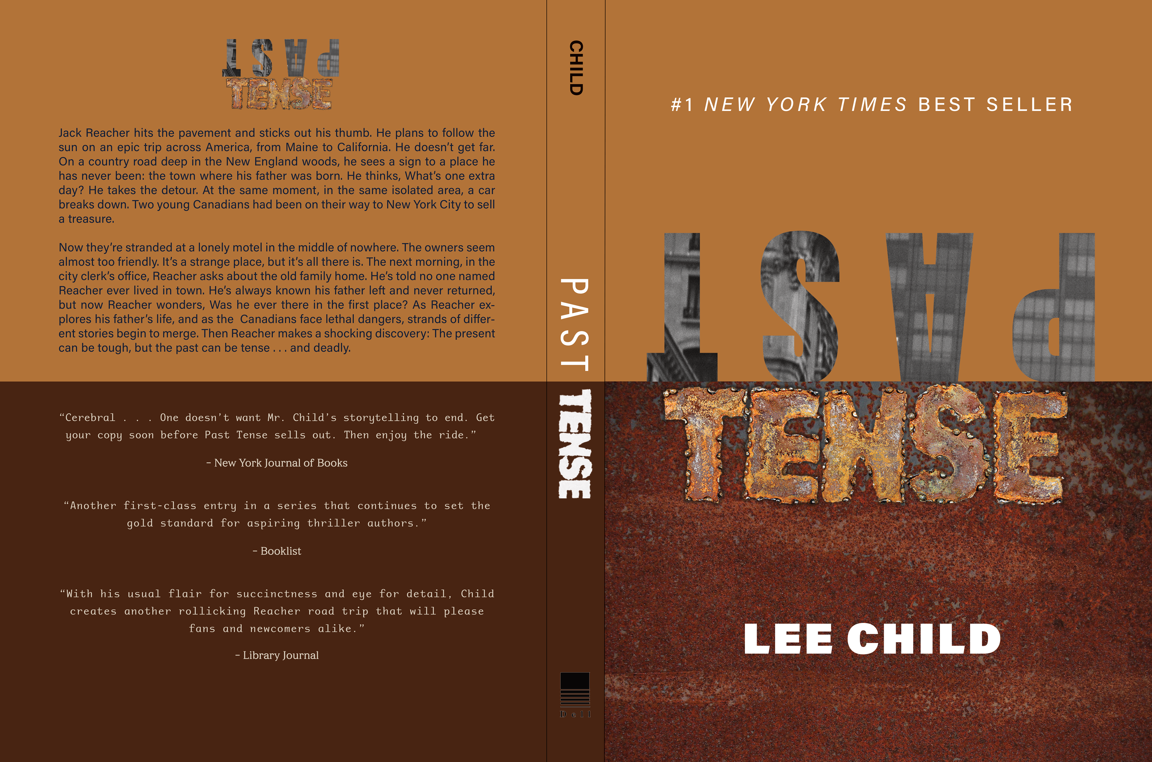
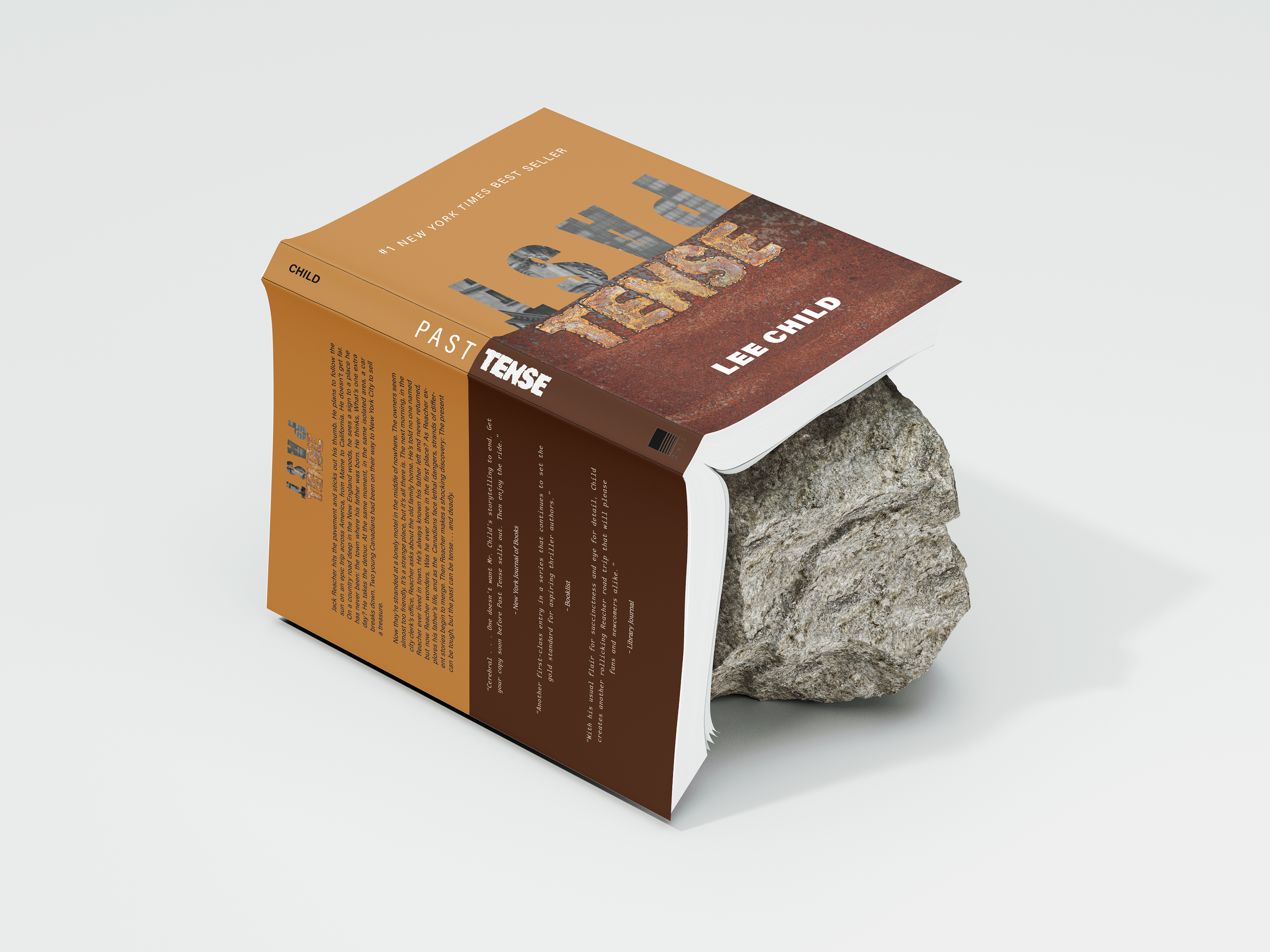
This is a book cover titled “Past Tense”. The title Tense was welded together and cut out in photoshop. The rest of the book was made in Adobe illustrator. The cover was made in 2021. This cover was made with the story ending in mind as the book convert hard-set realities of life the rust evokes that feeling and the black and white "PAST" text does the job of conveying a clear history that cannot be changed or forgotten. The RUST letters were cut and welded in person.
Sophomore S/2021
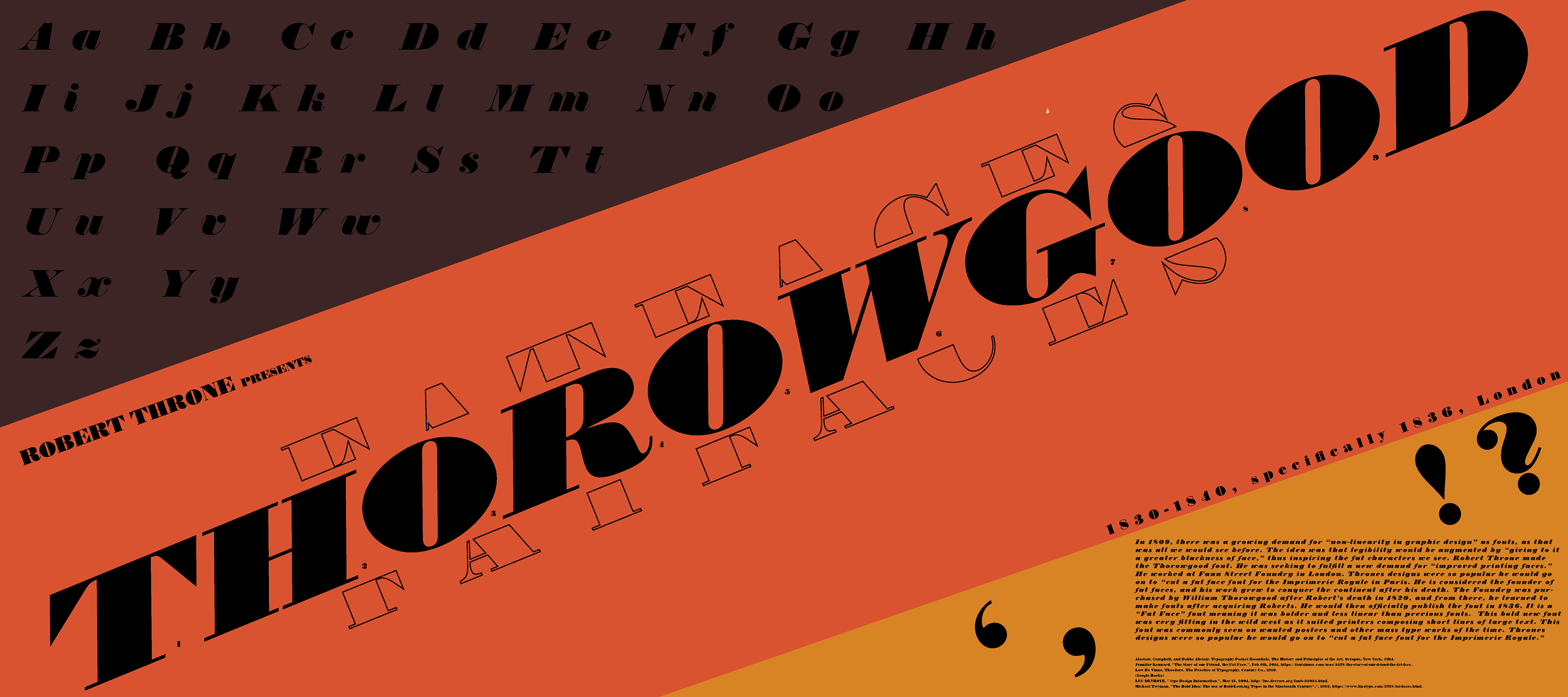
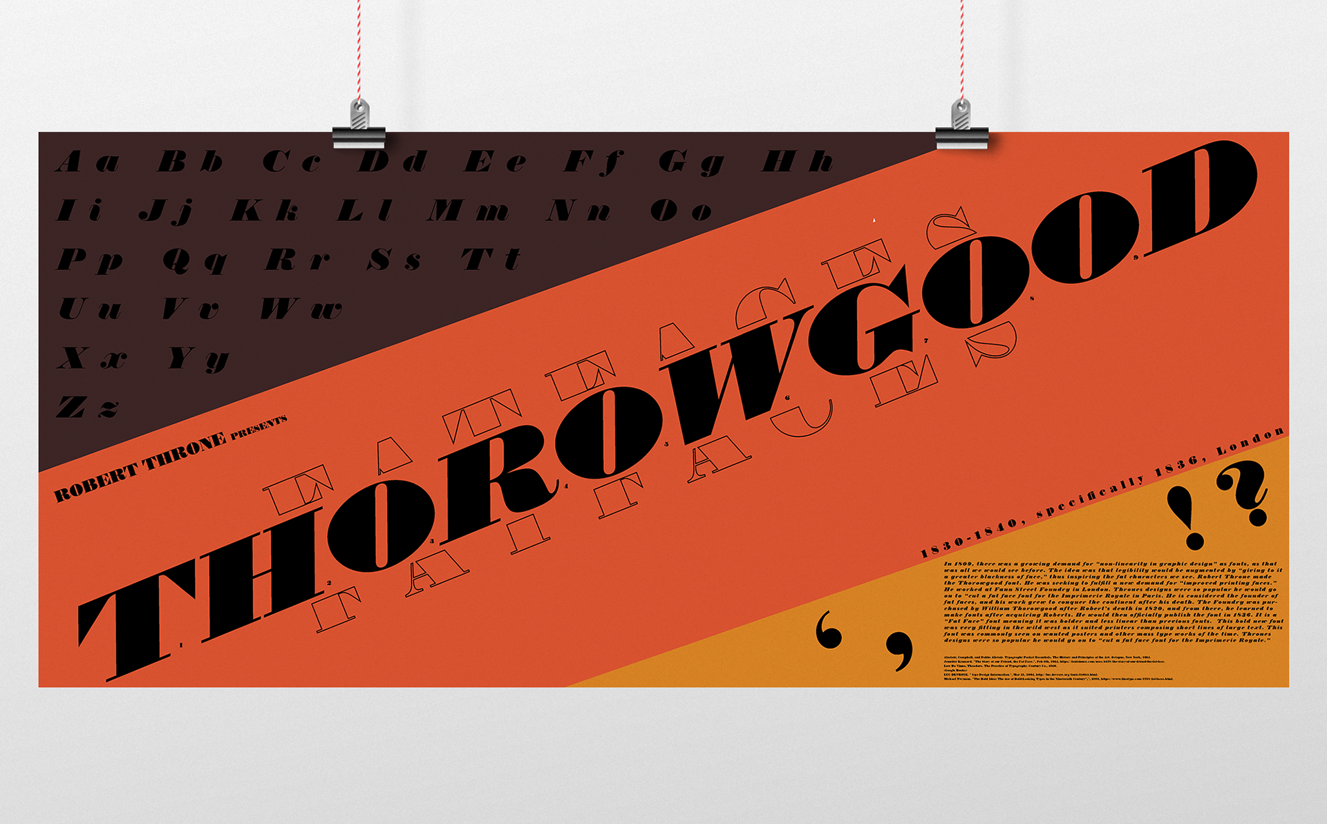
The title is “Thorowgood”,named after the font, the year this was made is 2021 for a project called "Font Showcase". The style of the font is not linear and to showcase that I created a digital poster in photoshop with a diagonal layout that displayed the entire font's visual prowess. This piece was meant to showcase the pop that this font has along with the entire set of characters that it contained so it has a diagonal layout to draw the eye across the piece.
Sophomore 2019
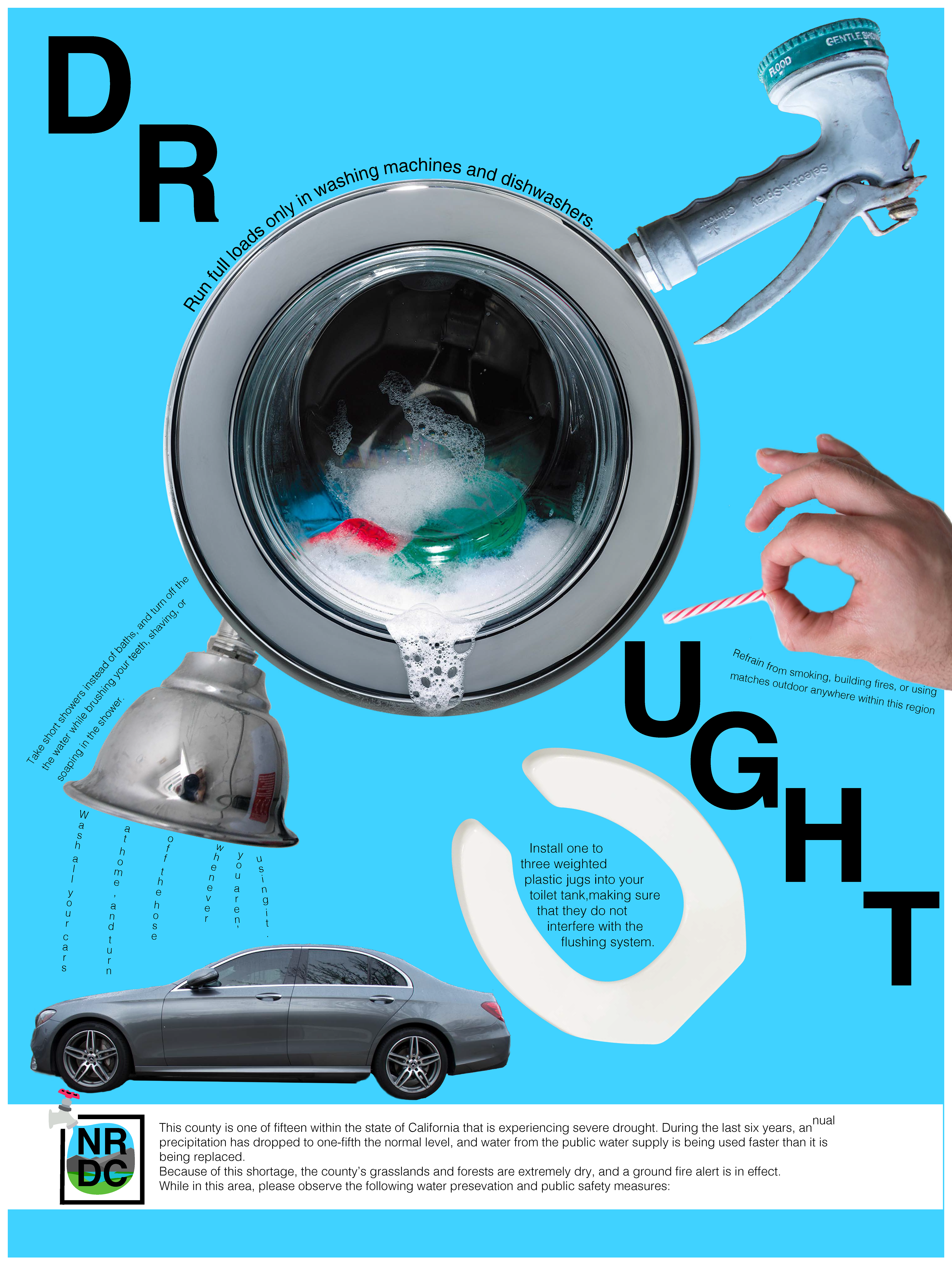
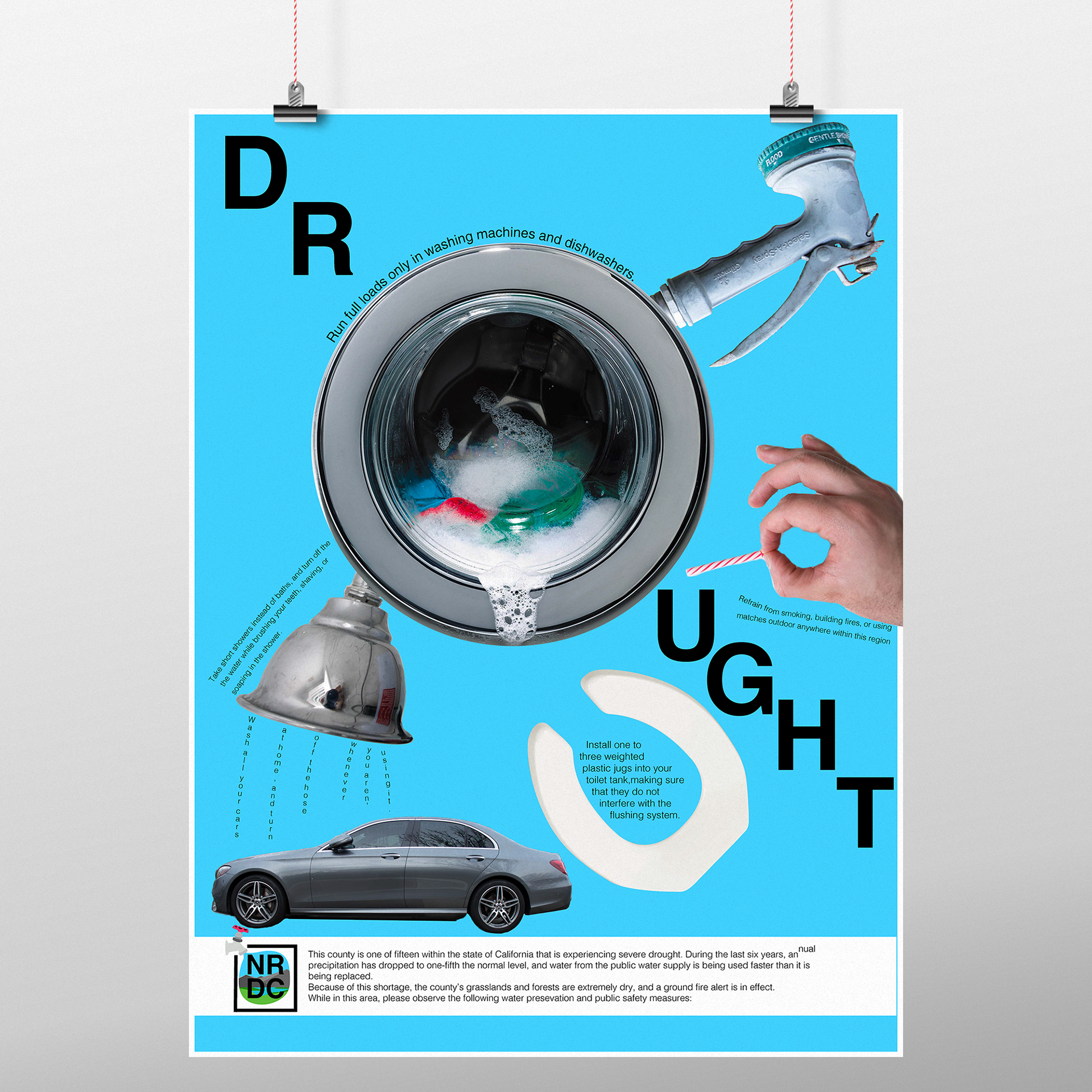
This poster is called “Drought” . It was made in 2019 to express awareness of all the things that cause a water shortage for a project called "Environment PSA". The medium is digital and it was made in both illustrator and photoshop with custom vector logos and color selection. The point of this piece was to make the eye go across the piece making the viewer find the interesting text and pictures that are all over to provide a more fun way of learning about water conservation.
Freshman 2018
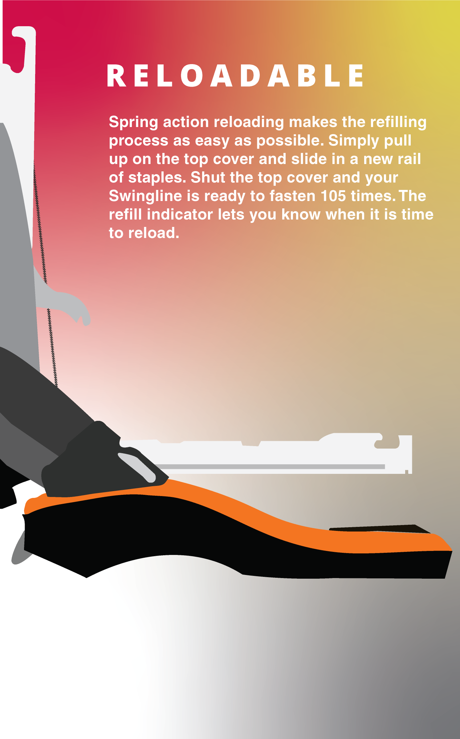
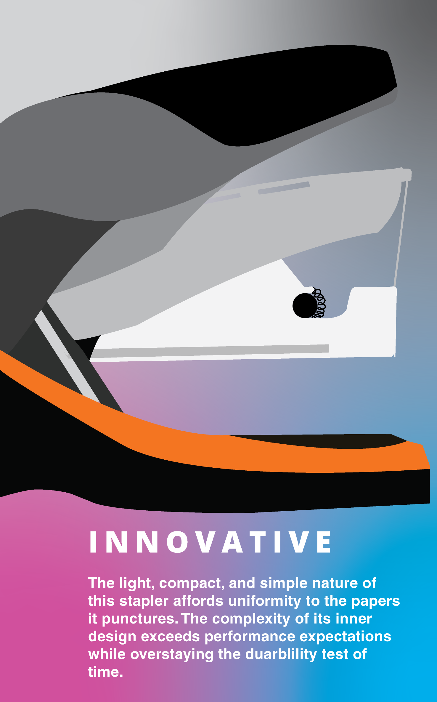
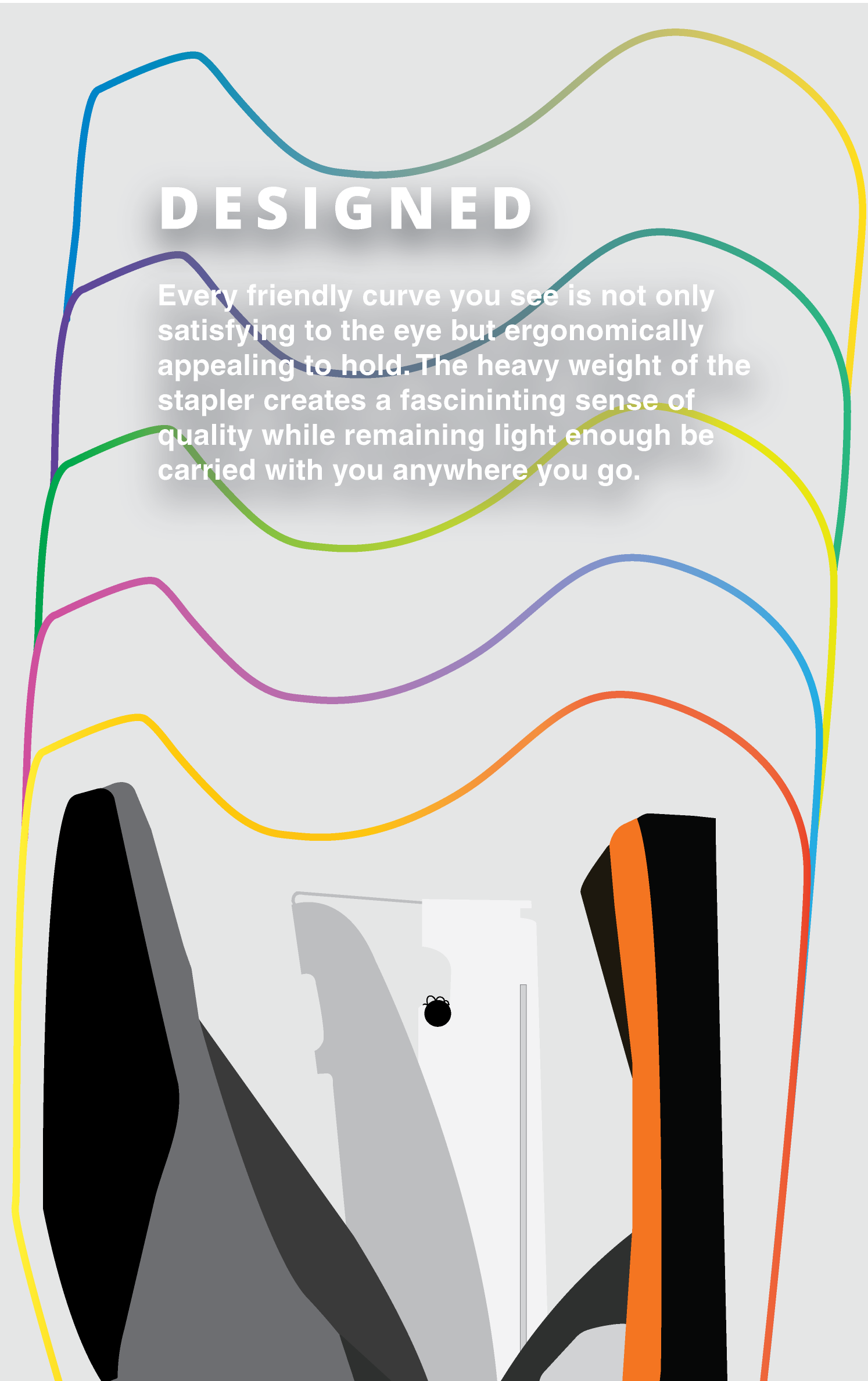
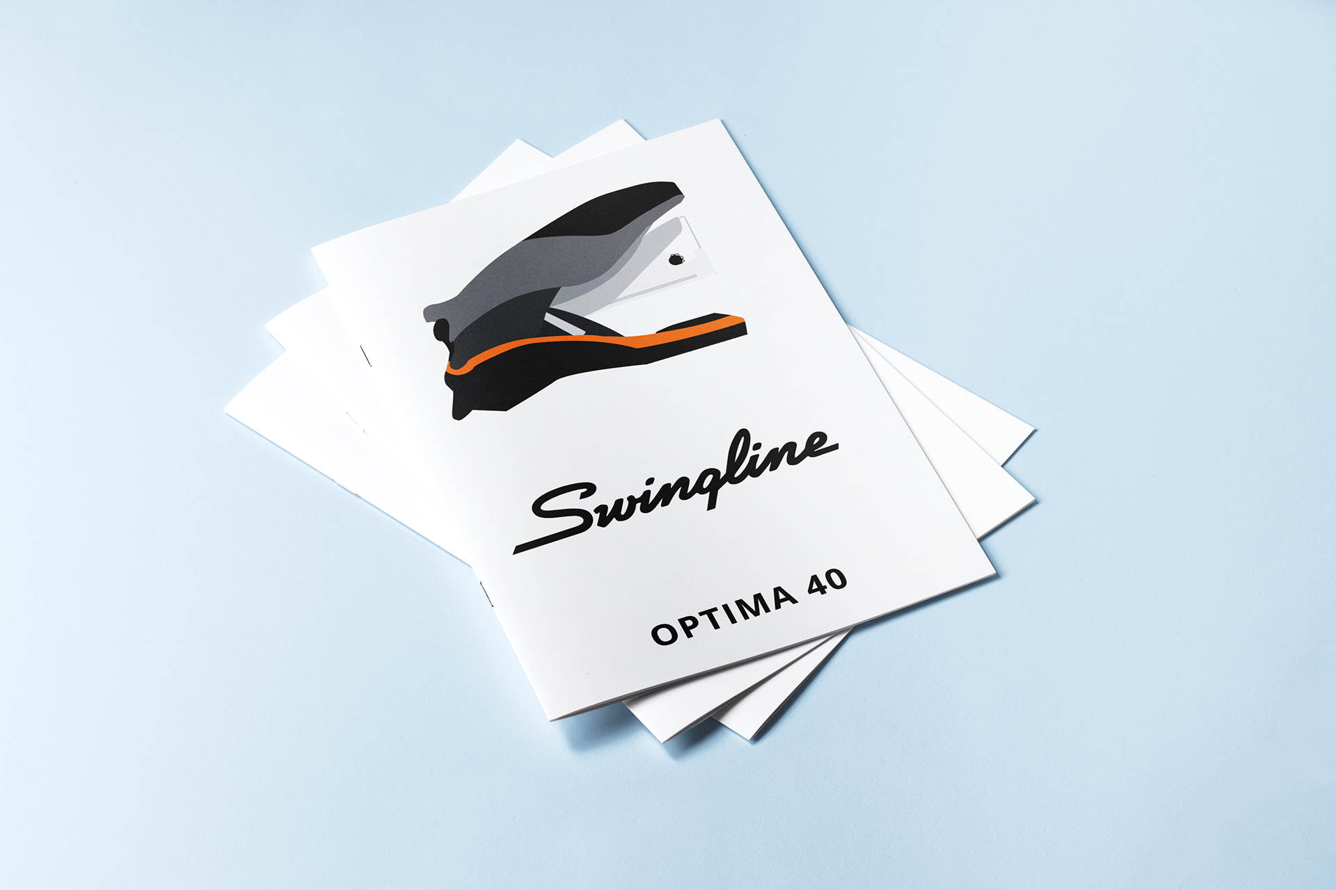
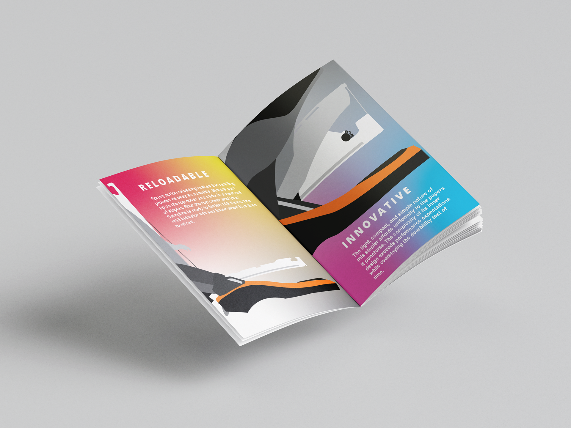
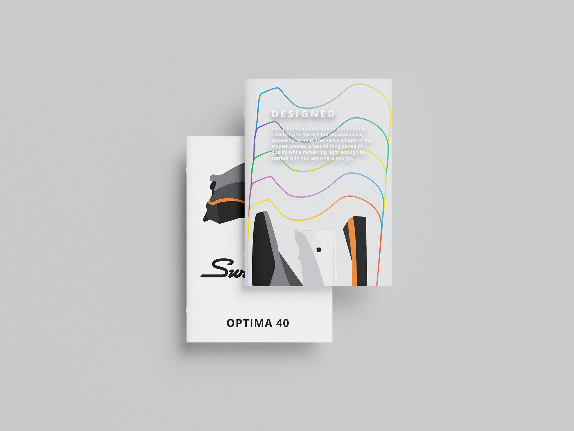
This work is called “Swingline Optima Brochure”; it was made in 2018 being my second project in college it has 5 total pages. The idea was to convey the best functions of this stapler and sell it. It was made in Adobe Illustrator. The brochure showcases the specifics of the stapler that make it so unique and make someone want to buy it as the use of colors, type, and copy make it a more compelling object.


Freshman 2018
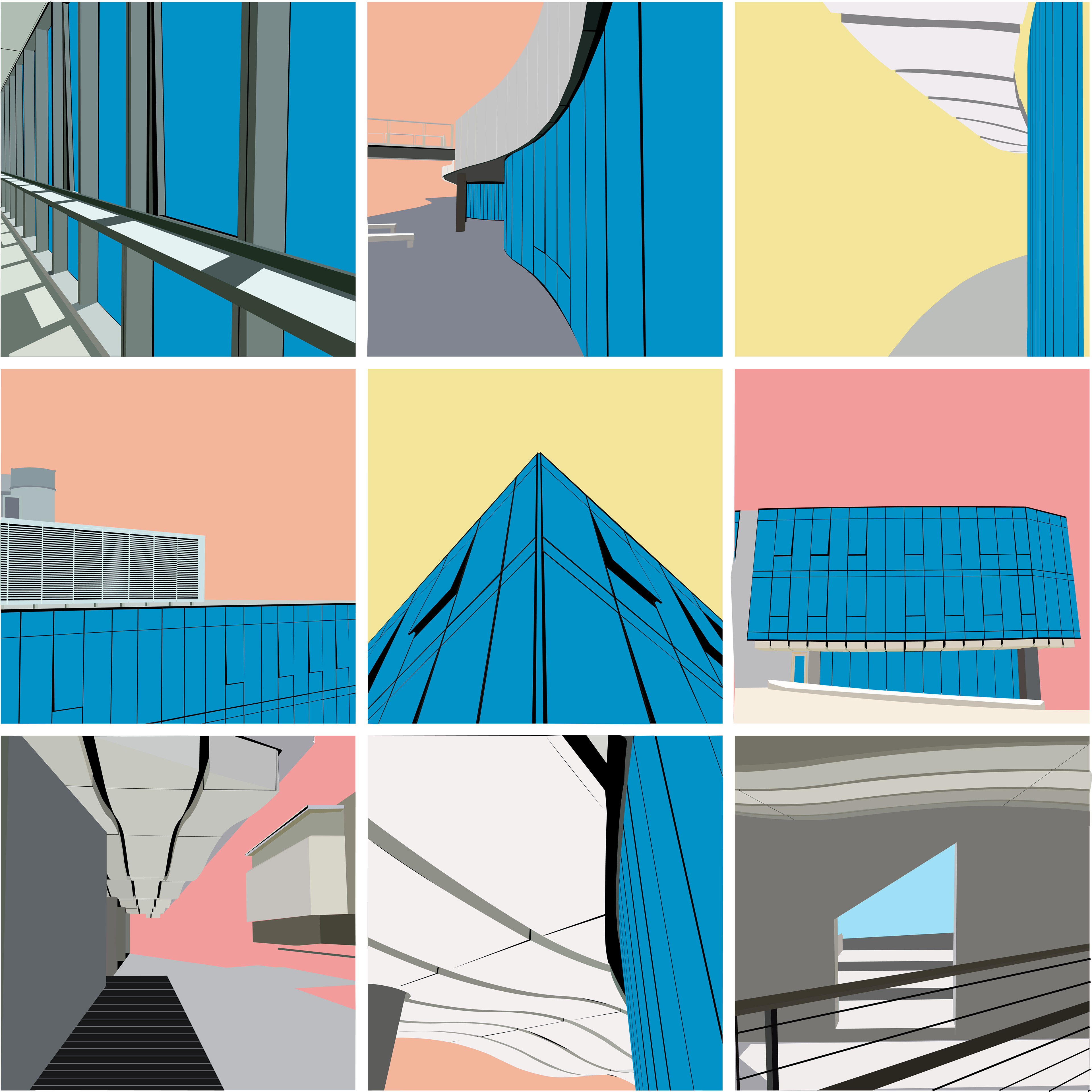
This was my first project in college, titled "USF in Vector" each tile in the grid was drawn with the pen tool in Illustrator based on photos I had taken on college campus. It combines photography, learning the pen tool with repetition, and careful yet accurate color choice. This was a great first project that made me comfortable with Illustrator and how the pen tool works setting me up for years to come. In the individual tiles, you can view the full detail of each line as nothing is copy pasted.
Click Any Piece for a Full Size Image